[Prize Winners]
Best In Show
Paul Shipper
Medium: Acrylic and pencils (35 x 50 cm)
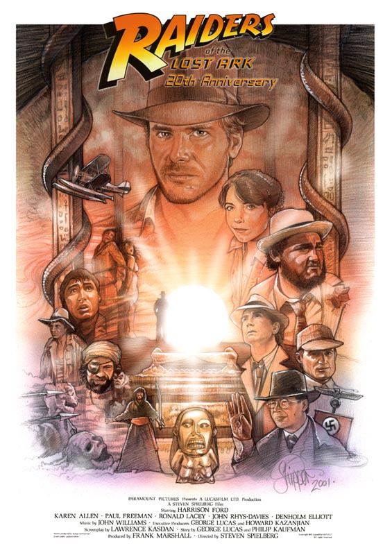
When the image of Mr. Shipper's work first appeared on my computer screen, I belted out "F--- YEAH!". The comment was clearly heard by several concerned co-workers outside of my office. It's a crude statement, yes, but accurate in my initial response to the work. But even this "Best in Show" contribution wasn't without some debate; though Micah and I both felt that Mr. Shipper clearly deserved top prize, we argued over WHICH of his two pieces would be deemed the favorite. In the end, Micah sided with my choice: this piece, a breathtaking movie poster featuring a montage of events and characters from the film. Full of color and vivid detail, what sets this piece above the rest is not just that it captures the characters so well, but rather that the overall design and layout of the work -- look at the "framing" of the Ark -- illustrates a superior eye. It's one thing to draw a good likeness; it's another thing to do it in a stylistic way. And that's what this has: STYLE! This is not a carbon-copy image from a film still; it is a lively, exciting piece that is so good, it makes you want to see the movie again. Thanks Paul... This piece alone made it all worthwhile!

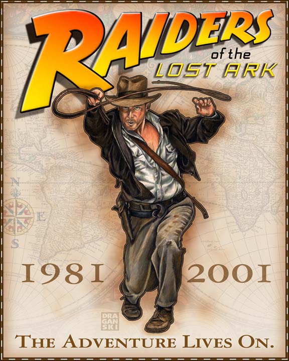
Check out Paul Shipper's other notable entry


Second Place
The Adventure Lives On
Ed Draganski
Medium: Color pencil, watercolor, Adobe Illustrator & Photoshop (16"x20")
I LOVED this piece -- it looks like a professional marquee or emblem to celebrate the film. (And YES, the Indy featured here is indeed a drawing, demonstrating Ed's artistic craftsmanship.) Sometimes simplicity is the most effective tactic to capture the eye -- and that's what Ed has done here. Beautiful, clean, snappy, elegant work -- perfectly fitting the theme of the contest, and just the kind of art we were looking for!

Check out Ed Draganski's other notable entries


Third Place (Most Humorous)
Trevor Grove
Medium: Adobe Photoshop
Yes, the "South Park" thing was also done last year, but Micah and I laughed so hard at this, we just HAD to pay it special recognition. If the SOUTH PARK creators were to ever re-envision our bullwhip-toting archaeologist, Trevor's the guy to show them the way. The charm of this painting is how skillfully Trevor was able to take our favorite characters and reduce them to such cartoonery without losing their identities. (Even the kind folks of Stevie and Georgie don't escape.) Compare it to Stuzan's international poster (also used for RAIDERS' 10th anniversary), and you'll get the idea. My only gripe about this work is that it featured the 10TH ANNIVERSARY "Raiders" logo -- it's been 20 years, Trevor... 20 YEARS!!!

Adventure's 20th
Austin Powers
Medium: pencil on sketch paper (14.5"x18")
A wonderful collage of characters and events from the film. done in beautiful black and white. The likenesses are uncanny, and the detail is impeccible. However, I felt that this piece didn't have as effective a dramatic design and layout that, say, Mr. Shipper's poster art did -- the images, to me, seemed a bit too jumbled & chaotic. Still, a very well done piece that earned its way to fourth place ranking.

Most Original
Zawiah Zainudin
Medium: pencil, colored in Adobe Photoshop (37x27 cm)
This piece actually was one of my personal favorites among all the submissions, because I've never seen anything like it before. Both humorous and exacting in its detail (compare it to the film -- go ahead!!!), it's fun to see Indy in all of his guises throughout RAIDERS. I truly love this work -- so much so that I printed a copy out and placed it on my fridge!

Check out Zawiah Zainudin's other notable entry


Paul Lopez
Medium: acrylic
Paul's entry is a colorful, montage style illustration. I liked the design and texture of the work, and admired how he chose to select a more "romantic" image from the film, but again this didn't have quite as dramatic an effect as Mr. Shipper's poster.

Graham Clark
Medium: pencil (A4 paper)
An extremely well done rendering of Indy snatching the Idol within the film's opening. My big reservation toward this piece was that it, while clearly skillfully executed, was little more than a reproduction of a still, drawn without a stylistic design or creative approach.

<== ==>


[Indyfan.com] Site Author: Micah Johnson
Page Author: Micah Johnson
Created: June 11, 2001
Last modified: June 19, 2001